

family song koh lipecase story
Branding, Logo Design, and Visual Identity
Market Positioning:
Family Song Koh Lipe is a beloved local hospitality brand that blends beachfront relaxation with bold, adventurous spirit. Located on the iconic Thai island of Koh Lipe, it attracts independent travelers, island lovers, and deep-sea fishing enthusiasts alike-offering an experience that is as raw and real as the nature surrounding it.
Year: 2019
Services Provided:
– Logo and brandmark design
– Visual identity and brand book
The vision behind the brand
One of the things we love most about our agency is our creative range. We work with premium brands and global corporations, but when a project speaks to us, we happily trade our “aristocratic” hats for streetwear caps. Family Song Koh Lipe was exactly that kind of project: independent, wild, and full of personality.
What the brand Is Today
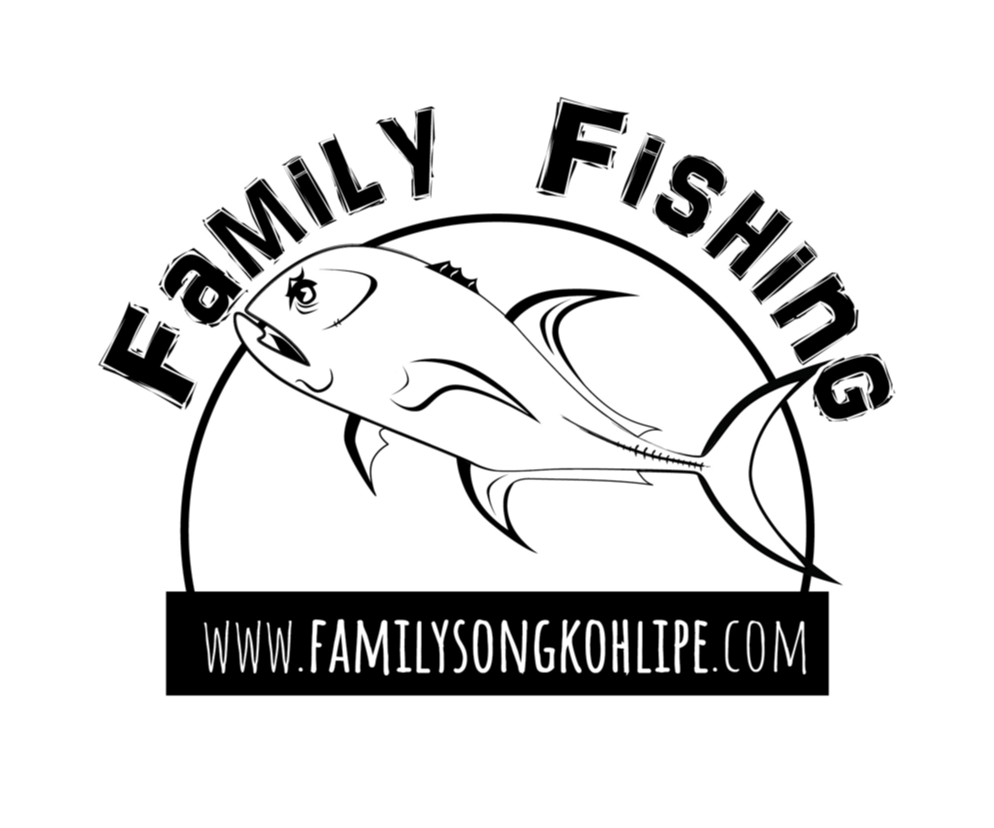
Family Song Koh Lipe is more than just a place to stay-it’s an island lifestyle brand. The logo, still proudly in use today, has become a badge of belonging for both staff and loyal guests. It communicates authenticity, raw energy, and that no-filter island freedom that resonates with travelers seeking something real and unpolished.
The client, Cristiano, wanted a brand identity that would reflect the grit and character of his team-and the tough ocean environment they thrive in. Ocean fishing is a key part of the Family Song experience, and the logo had to feature the king of the seas: the giant trevally, one of the fiercest game fish out there.
Our Strategic Contribution
We created a bold and striking visual identity that captures the soul of the business. Main design goals included:
– Authenticity and adventure
– Island culture with attitude
– A logo that could live on T-shirts, signs, and boats alike
The giant trevally was carefully illustrated as a custom vector drawing, giving the logo a strong identity with unique details. The typography is bold, rugged, and slightly rebellious-just like the people behind the brand. This is branding that speaks directly to its audience, no filter needed.
Why It Works
The logo doesn’t try to be trendy-it’s true. It gives Family Song a strong, unified visual presence that represents the team’s spirit, the island lifestyle, and the kind of clients they attract: bold, independent, and unforgettable. It’s a design that looks great on a business card-but even better on a weathered boat in the open sea.
Why Work with Us for Logo and Brand Design
We’re not limited by industry or format-we’re powered by curiosity and vision. Whether it’s a global corporation or a local legend, if a project has soul, we know how to bring it to life with the right visual identity and attitude.
Related Contents
Oracle Architects: Content Strategy and Editorial Direction
Content strategy and editorial direction for Oracle Architects, focused on sustainability, AI in design and circular architecture. The framework supported a clearer brand narrative and keyword-based content activation.
Bocconcino: Restaurant Communication and Content Strategy
Bocconcino is an Italian restaurant in Phuket with a strong local and seasonal audience. LADICT developed content strategy, brand voice, social media planning and community-focused communication to support visibility, engagement and off-season traffic.
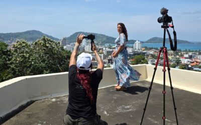
Lucia Meloni: Music Video Production
Music video production for Lucia Meloni’s track Amarsi senza voglia, filmed in Phuket with a lifestyle and backstage approach. The project combined fast production, senior creative direction and in-house execution.