LAMOET.COMcase story
UX/UI Design, Brand Interface & Digital Identity
Market Positioning:
La Moet is a private boat charter company in Phuket, Thailand, offering curated maritime experiences aboard traditional wooden boats. Positioned in the premium tourism segment, La Moet focuses on authentic, intimate, and scenic journeys—targeting discerning travelers looking for relaxation, exclusivity, and local charm.
Year: 2014
Services Provided:
– UX/UI design
– Information architecture
– Visual identity adaptation for web
– Color palette and typography system
– Interface structure and user flow
The vision behind the project
When La Moet approached us in 2014, the concept of user experience (UX) design was still relatively new in the region. Yet the client had the foresight to invest in an interface that would reflect the elegance, warmth, and authenticity of their unique tourism offering.
The goal was to create a visually inviting and easy-to-navigate interface, where users could quickly grasp what the experience was about, explore available packages, and connect emotionally with the brand—even before boarding the boat.
We focused on simplicity, soft tones, and a natural flow that would echo the charm of sailing on traditional wooden boats in the Andaman Sea.
What the PROJECT represents Today
More than a decade later, La Moet continues to use the same visual interface we originally designed. While some technical upgrades and backend improvements have been implemented, the core layout, UX structure, color system, and visual design remain untouched.
This is a strong validation of our approach: a timeless, purpose-built UX can support long-term business success—even in fast-evolving digital environments like the tourism sector.
Our Strategic Contribution
We designed and structured the entire interface to align with La Moet’s identity and audience. Key priorities included:
– Creating a calm, user-friendly web experience
– Communicating authenticity and trust from the first scroll
– Highlighting experiences, not just services
– Designing an interface that would stand the test of time
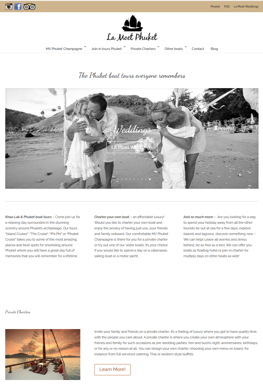
The layout features generous white space, an earthy color palette, clear call-to-actions, and intuitive access to packages, FAQs, and contact information. The result: a simple yet powerful digital touchpoint that continues to convert visitors into bookings.
Why It Works
La Moet’s website is a textbook case of effective UX matched with brand purpose. Designed before UX was mainstream, the interface still functions beautifully today—demonstrating the value of thoughtful design and a deep understanding of user behavior.
Why Work with Us for Logo and Brand Design
We specialize in building digital experiences that reflect your story, attract the right audience, and remain relevant over time. Whether you’re launching a new product or preserving a heritage brand, we turn ideas into long-lasting, user-centered interfaces that truly perform.
Why It Works
The design is both symbolic and strategic. It reinforces the content’s credibility while adding visibility and aesthetic strength. This project also confirms our agency’s ability to collaborate with academic, policy, and innovation-driven environments, contributing meaningfully to knowledge-based communication.
Why Work with Us for Logo and Brand Design
We craft design that respects complexity and enhances communication. Whether it’s for academic publications, policy reports, or research-based media, we bring visual clarity and cultural sensitivity to each project—bridging content and audience with intention.
Related Contents
etiquette food and travel
Etiquette Food & Travel is Cambodia’s first luxury etiquette training program, launched to serve the emerging needs upwardly mobile generation
oyika
Positioned at the intersection of sustainability and accessibility, the brand targets users who are concerned about climate change but may lack the financial means to purchase high-end EVs or manage the ongoing cost of gasoline.
Oracle Architects – Content Strategy – Editorial Direction
Content strategy kickoff for Oracle Architects, an innovative architecture studio in Southeast Asia. We developed a keyword-based editorial structure with a focus on sustainability, AI in design, and circular architecture. Content activation for sustainable brand.


