LAMOET.COMcase story
UX/UI Design, Brand Interface & Digital Identity
Market Positioning:
La Moet is a private boat charter company in Phuket, Thailand, offering curated maritime experiences aboard traditional wooden boats. Positioned in the premium tourism segment, La Moet focuses on authentic, intimate, and scenic journeys-targeting discerning travelers looking for relaxation, exclusivity, and local charm.
Year: 2014
Services Provided:
– UX/UI design
– Information architecture
– Visual identity adaptation for web
– Color palette and typography system
– Interface structure and user flow
The vision behind the project
When La Moet approached us in 2014, the concept of user experience (UX) design was still relatively new in the region. Yet the client had the foresight to invest in an interface that would reflect the elegance, warmth, and authenticity of their unique tourism offering.
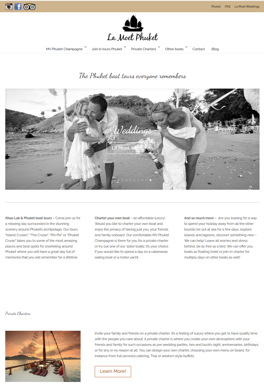
The goal was to create a visually inviting and easy-to-navigate interface, where users could quickly grasp what the experience was about, explore available packages, and connect emotionally with the brand-even before boarding the boat.
We focused on simplicity, soft tones, and a natural flow that would echo the charm of sailing on traditional wooden boats in the Andaman Sea.
What the PROJECT represents Today
More than a decade later, La Moet continues to use the same visual interface we originally designed. While some technical upgrades and backend improvements have been implemented, the core layout, UX structure, color system, and visual design remain untouched.
This is a strong validation of our approach: a timeless, purpose-built UX can support long-term business success-even in fast-evolving digital environments like the tourism sector.
Our Strategic Contribution
We designed and structured the entire interface to align with La Moet’s identity and audience. Key priorities included:
– Creating a calm, user-friendly web experience
– Communicating authenticity and trust from the first scroll
– Highlighting experiences, not just services
– Designing an interface that would stand the test of time
The layout features generous white space, an earthy color palette, clear call-to-actions, and intuitive access to packages, FAQs, and contact information. The result: a simple yet powerful digital touchpoint that continues to convert visitors into bookings.
Why It Works
La Moet’s website is a textbook case of effective UX matched with brand purpose. Designed before UX was mainstream, the interface still functions beautifully today-demonstrating the value of thoughtful design and a deep understanding of user behavior.
Why Work with Us for Logo and Brand Design
We specialize in building digital experiences that reflect your story, attract the right audience, and remain relevant over time. Whether you’re launching a new product or preserving a heritage brand, we turn ideas into long-lasting, user-centered interfaces that truly perform.
Why It Works
The design works because it connects the emotional promise of a private boat experience with a simple browsing path. The interface supports trust, exploration and booking confidence without overcomplicating the journey.
Why Work with Us for Logo and Brand Design
We create digital interfaces that respect the character of the experience and make the decision path easier for the visitor. For travel and hospitality brands, that means combining visual atmosphere, clear structure and practical UX choices that help people understand the offer and take action.
Related Contents
Luca Cini: Logo Design and Packaging
Luca Cini is a long-standing Phuket wine and food destination with an Italian hospitality identity. LADICT developed the rebranding, logo design, packaging system and shop graphics, creating a visual identity that has remained recognizable and commercially useful for more than a decade.
AI Forum Cambodia: Logo for Social Impact Project
Logo and visual identity for AI Cambodia, a social-impact initiative focused on responsible AI development in Southeast Asia. The branding supports institutional trust, inclusion and long-term public dialogue.
Microtecnology SRL: Logo Design
Rebranding project for Microtecnology SRL, including logo, brochure and website direction. The identity communicates precision, trust and industrial expertise for lifting and automation systems.