mangano robotcase story
Branding, Logo Design, and Visual Identity Project
Market Positioning:
Mangano Robot is a recognized leader in the field of industrial robotics and automation. Known for cutting-edge engineering, innovation, and reliability, the company is a benchmark for automation solutions in high-precision sectors across Europe and beyond.
Year: 2014
Services Provided:
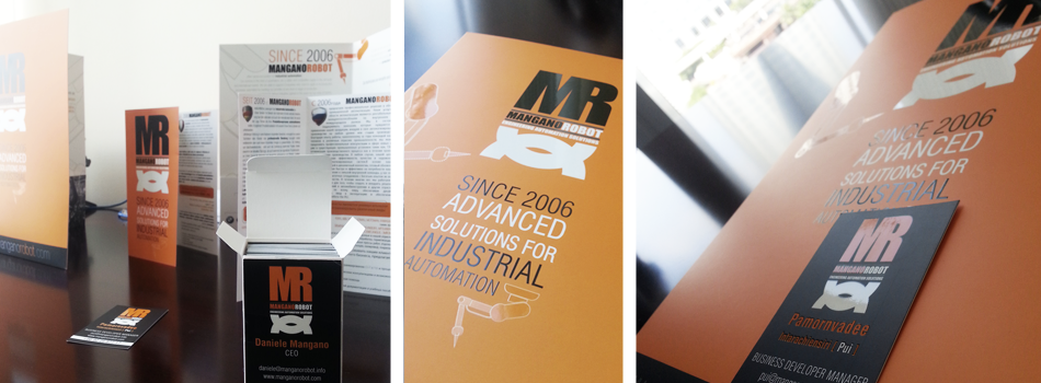
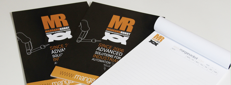
– Logo and brandmark design
– Visual identity development
– Complete brand book
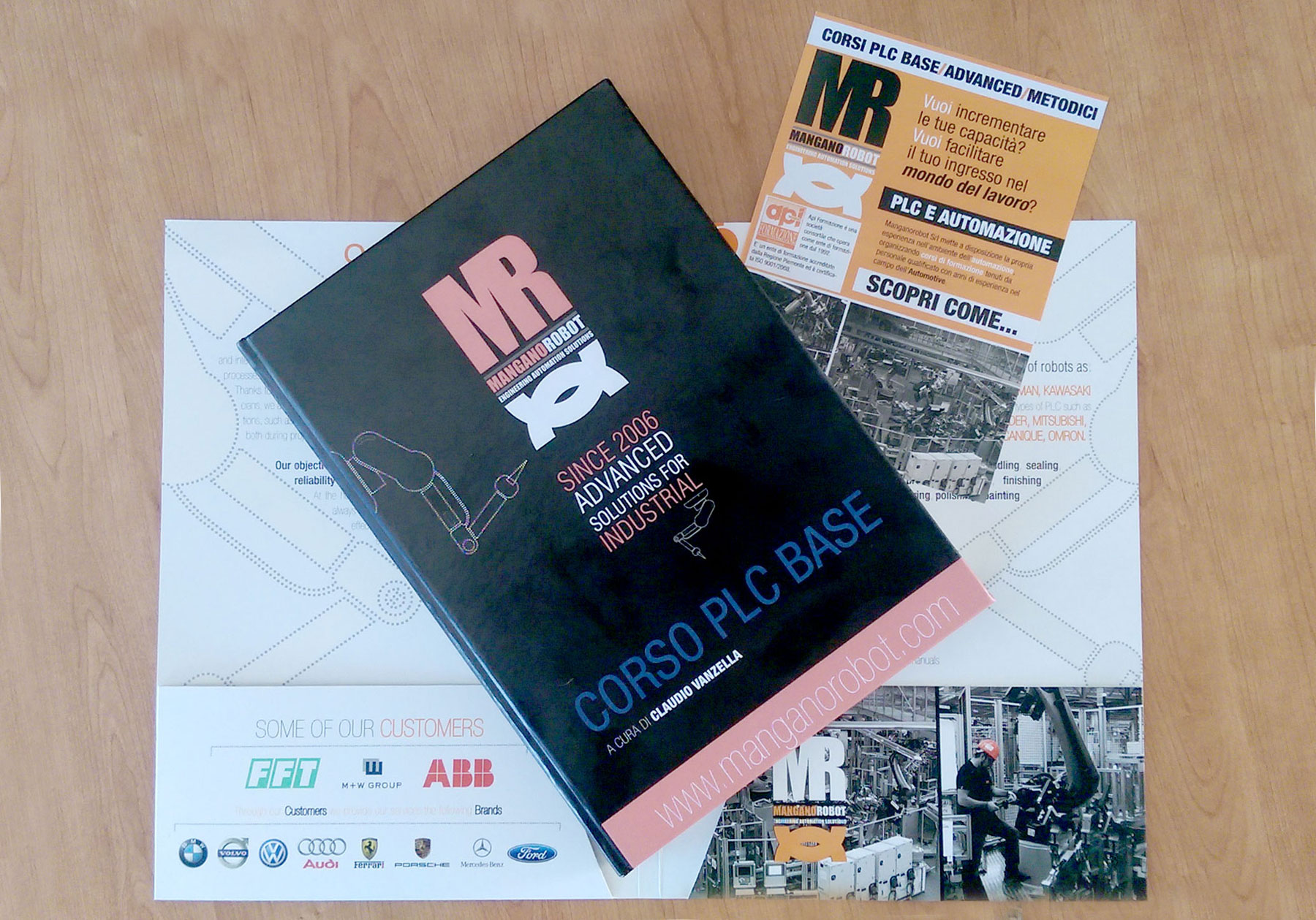
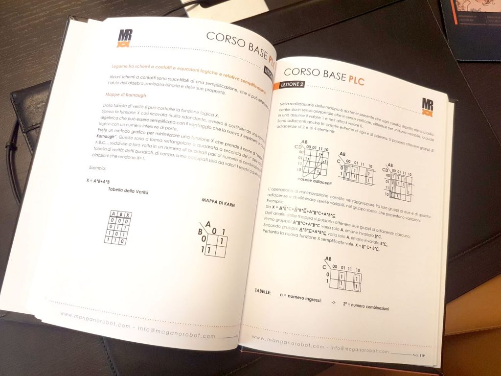
– Editorial design and layout for training manual
Together with rebranding activities, we designed the full layout and editorial style of “Corso PLC Base”, the first Italian-language PLC training manual developed by Mangano Robot.
Our work ensured clarity, consistency, and visual engagement across all educational content-strengthening the company’s commitment to training and knowledge sharing.
The vision behind the brand
In a sector dominated by technological innovation, Mangano Robot needed a brand identity that could match its level of excellence. The objective was to create a visual system that would reflect the company’s forward-thinking mindset, Italian engineering heritage, and solid international ambitions.
What mangano Is Today
Mangano Robot stands out as a top-tier automation brand, delivering robotic systems and automation solutions to some of the most demanding industries, from automotive and aerospace to manufacturing and high-tech production. The company continues to grow internationally, and its name is associated with quality, precision, and reliability.
Our Strategic Contribution
Our branding intervention had a significant impact on the brand’s market positioning and recognition. We designed a visual identity that communicates:
– Performance and precision
– Italian mechanical passion and design
– Exclusivity and instant recognition
The logotype was developed using the initials of DUCABIKE, placed within a geometric shield shape that evokes the feel of performance badges and racing emblems. The color palette – red, white, and black – was chosen to convey energy, elegance, and strength. The resulting mark is highly recognizable and easily adaptable across a wide range of physical and digital applications, from mechanical components to the motorcycles themselves.
Why It Works
Mangano Robot’s brand identity speaks to engineers, investors, and global partners alike. The logo is immediately recognizable, reflecting the company’s high standards and technical reliability. It’s a perfect example of how brand design can communicate leadership in a highly specialized market.
Why Work with Us for Logo and Brand Design
We specialize in translating complexity into clarity. For companies operating in advanced sectors like tech, engineering, or industry, our designs offer more than aesthetics-they deliver meaning, function, and recognition. Every detail is intentional. Every solution is strategic.
Related Posts
SELECT Luxury Guidebook
SELECT is a high-end luxury travel and lifestyle guidebook created for Phuket’s premium hospitality market. LADICT developed the editorial design, visual rhythm and luxury publishing system for a print product distributed through leading resorts.

Cyberspace Cambodia: Cover Design
Cover design and editorial concept for Cyberspace Cambodia, the first book exploring Cambodia’s digital future. The visual identity used Angkor Wat satellite imagery to connect heritage, technology and global thought leadership.
Family Song Koh Lipe: Logo Design
Custom logo design for Family Song Koh Lipe, an independent beachfront business in Thailand. The identity uses a bold giant trevally mark to express ocean adventure, island life and authenticity.